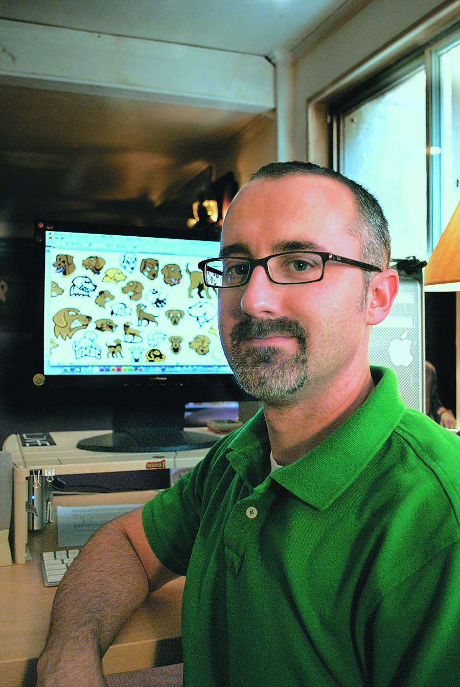
With Jim Lord ’99, Design Director, Creative Services
They say you can’t teach an old dog new tricks, but how about an old Dawg?
As universities change, mascots evolve along with them, and so it goes for True Grit this summer with the rollout of a brand-new look, as voted upon by more than 2,500 students, faculty, staff and alumni.
Creating a new athletics mascot for UMBC was more than a simple point of pride for Design Director Jim Lord ’99, visual arts – it was a matter of keeping up with the big boys of university athletics. As designer of the latest and most recent athletics mascots, Lord was perhaps the biggest critic of his past work – and one of the biggest proponents of change.
Step 1: Sniff around to find out who’s top dog
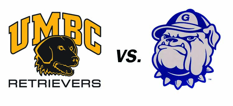
For Lord, seeing the Retrievers men’s basketball team advance to the courts of the 2008 NCAA tournament – and comparing the Dawgs’ 10-year-old athletic mascot to that of their opponents, the Georgetown Hoyas, on the national stage – was enough to spark the first conversation about a mascot facelift.
“We didn’t match up to our competitors,” he said. “In fact, we seemed kind of dated and flat in comparison.”
So, Lord started looking closely at the mascots of other universities and major sports teams. As a designer, he noticed some major trends – colorization techniques, letter blocking, etc. – and as an alum himself, he thought about ways of spinning the personality of the kind and loyal Chesapeake Bay Retriever into something fierce enough to put some scare into the opposing teams’ gym shorts.
Step 2: A lot of barks (and a little bite)
True Grit has not always looked like True Grit. In fact, the dawg has morphed over the years at least five times, shifting from a pointer and then semi-humanoid basketball dribbler in the 1970s, to a curly-haired sweetheart with a shield (early 1990s) or Maryland flag-inspired banner (late 1990s), to the dark and toothy version of the early 2000s, which Lord designed.
That’s why getting folks’ opinions was such a big part of the process, Lord said. As he made the rounds of focus groups with athletes, students, faculty, staff and alumni, he discovered (surprise!!) that people sometimes got a bit worked up about their favorites.
“It was a lot of fun finding out people’s opinions… that’s what we really did right this time,” said Lord. “We involved athletes and coaches and students and alums.”
Step 3: Try, Try Again
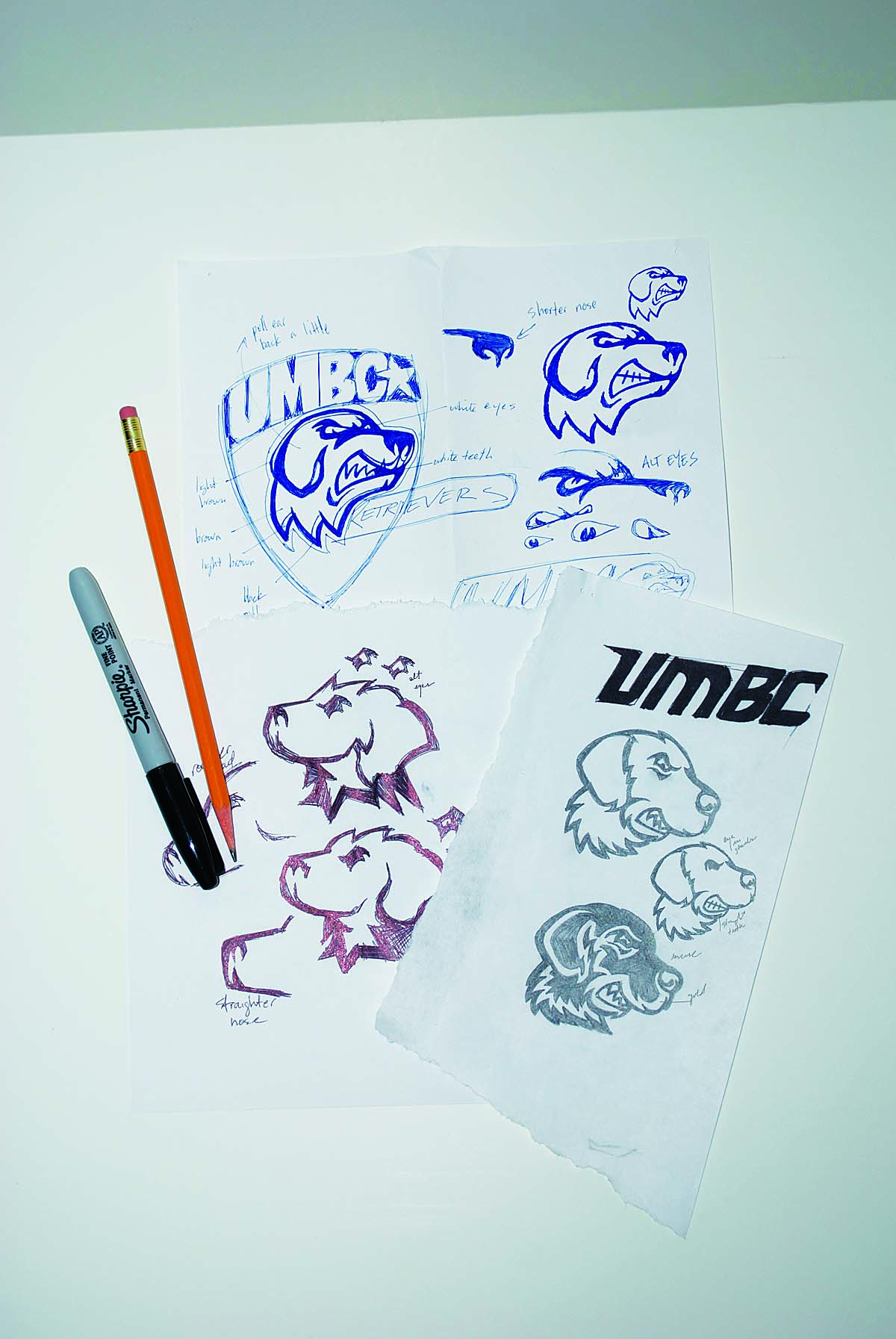
Over the course of half a year, Lord drew more than thirty different versions of the dog. Some had squinched eyes and snarling teeth. Some went heavy on the Chesapeake Bay Retriever curl. Or detailed muzzle and nose. Some, Lord tossed as soon as he drew them.
“For every couple that saw the light of day in the focus groups, there were four or five that I just said ‘No, that’s not cutting it’ – so I scrapped them,” he said. “There’s a fine line between realistic and cartoonish,” said Lord, who keeps some of his original pencil drawings on the board near his desk. “For a while, it seemed like no matter what I came up with, it still looked like a cartoon. What we really needed was something more stylized.”
Step 4: Let the dogs out
Just like a university athletics tourney, it was suddenly down to the final, um, three. Which, for Lord, meant hitting the streets once again for feedback from the coaches, the athletes – and just about everyone else in the UMBC universe.
“A lot of people needed to see it. They couldn’t always necessarily tell you what they want, but they could definitely tell you what they didn’t want once they saw it.”
During Homecoming weekend, Lord and fellow staff manned a voting station, where alums and students could choose their favorite. Soon after, an online poll was posted on myUMBC. With more than 2,500 votes by students, faculty, staff and alumni, UMBC had an overwhelming winner: one described by several alumni as “solemn,” “proud” and “strong.”
“I like it,” said Lord. “Times change, and trends change. I think we fit in a lot better with our competitors now.”
See a complete history of UMBC’s athletics logos online here.
Now What?
So how exactly does a university roll out a new mascot?
1. True Grit in the Bookstore and The Commons: With each new school year, the campus bookstore orders new t-shirts, sweats and other Dawg merchandise. Expect to see the new Retriever logo in the store starting May 12 – the same day The Commons will unveil a ginormous new Dawg on the walls of the Sports Zone.
2. True Grit on the Record: As the department of athletics updates its web and stationery, the dawg will become a presence on both.
3. True Grit in the RAC: Slowly, but surely, the new dawg will be replaced on the walls and seating of the Retriever Activities Center.
Tags: Summer 2010


