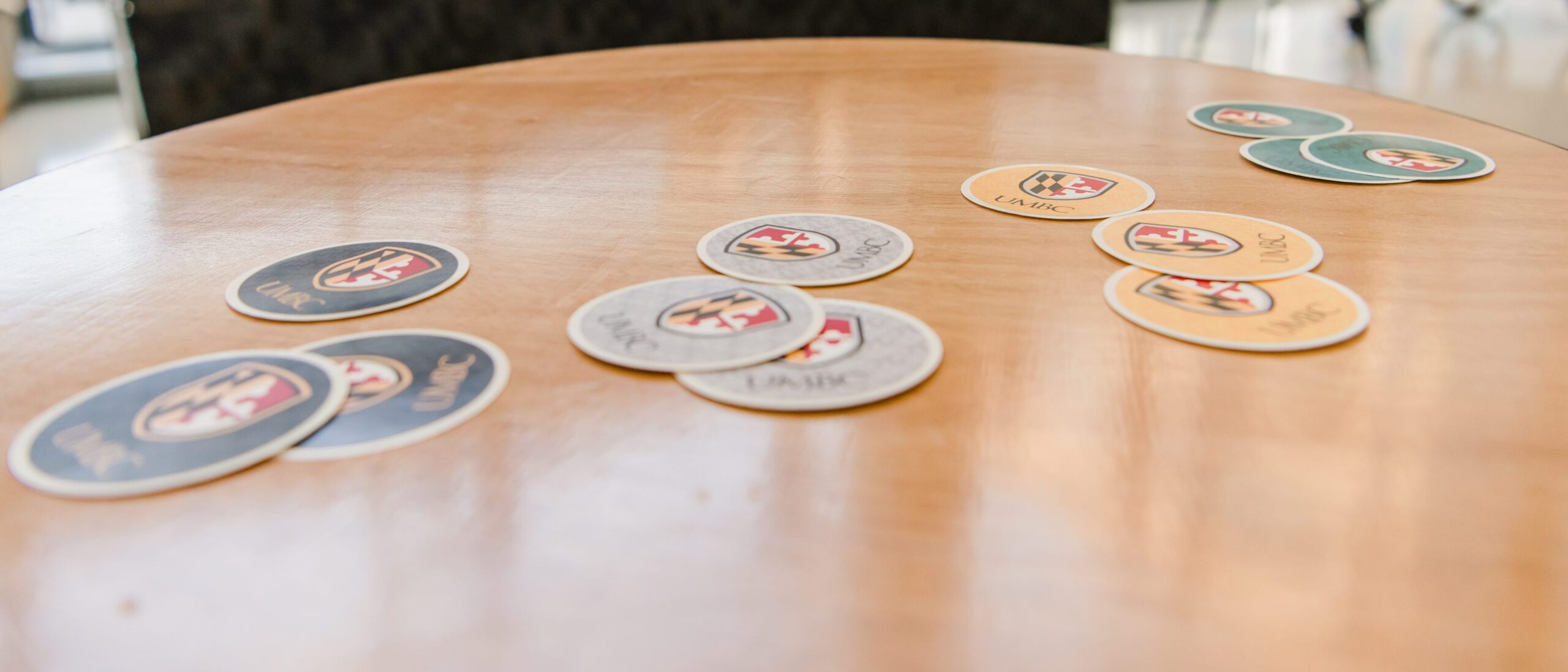
Earlier this month, UMBC officially launched a new icon and homepage as the culmination of a two-year, community-driven brand message and logo development process—the first University-wide branding initiative in UMBC history.
“Our community has been looking for new tools to share with others what the UMBC experience is all about. This work focused on developing those tools,” says Lisa Akchin, UMBC’s associate vice president for engagement.
Introducing this new brand is a powerful video with a message that will already be familiar to many in Retriever Nation.
This launch comes at an important moment for the University, following UMBC’s 50th anniversary, the start of the $150 million Campaign for UMBC, and UMBC’s historic 16-over-1 NCAA appearance in 2018. The project team set out to capture the essence of what makes UMBC such a distinctive community, and to share that vision with the world.
Putting it all together
UMBC’s Office of Institutional Advancement led the brand development project, in close collaboration with marketing and communications colleagues across the University, and with essential input from faculty, staff, students, and alumni. Jim Lord ’99, director of creative services and adjunct professor of visual arts, designed the striking new UMBC icon.
“As an alumnus of UMBC and Director of Creative Services, I was excited to work on the new logo. The project took a long time, but along the way, I was able to take direct feedback from so many of my colleagues across campus,” says Lord. “The logo that was ultimately selected received a positive response in the online surveys and it has been great to see the mark make its way onto campus and be used in the marketing materials.”
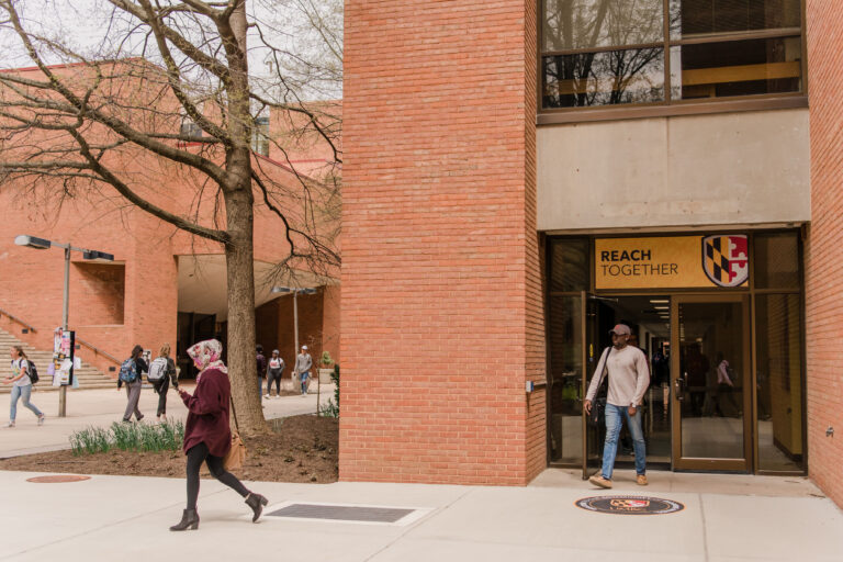
UMBC’s new icon is the most visible element of the branding project, but beneath it is a strong foundation of core ideas and values that define the University. The icon is also part of a larger fresh visual identity for UMBC, including UMBC logos, colors, letterhead, and guidance for sharing the UMBC experience through photography and video.
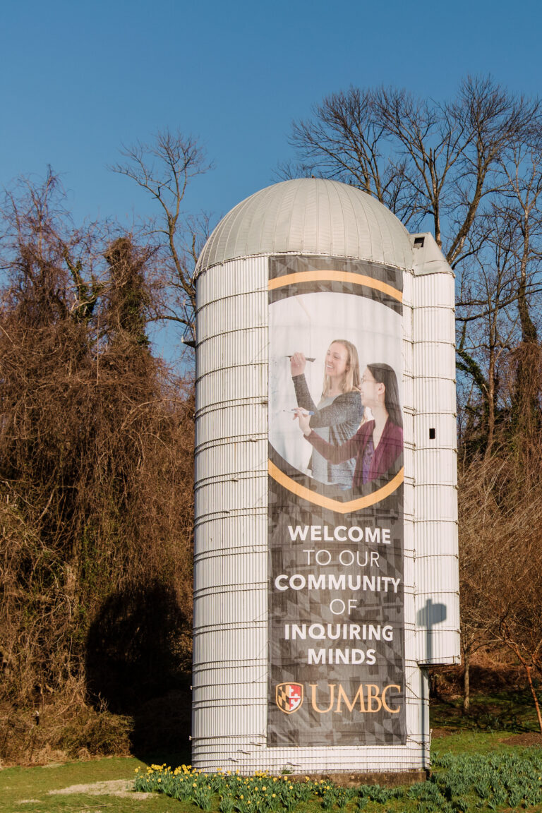
UMBC’s Creative Services team was tasked with bringing these ideas to life and the campus itself has gone through a springtime transformation. Windows are emblazoned with black and gold banners, a larger-than-life silo banner welcomes visitors to campus, and new pavement decals remind Retrievers that they’re part of a community with each passing step.
Laura Schraven, associate director for Campus Life marketing and communications, led UMBC’s student-focused design center, commonvision, to create supplemental materials highlighting UMBC’s new visual identity.
“It’s exciting to see people embracing the brand and wanting to use the logo, imagery and messaging in their materials. It is also a unique opportunity for our staff and student staff to become brand ambassadors,” says Schraven. “They are not just adding a logo to a brochure, they’re making sure that the brand is being reflected accurately and justly,” she explains. “This role gives another layer of investment in the brand from our students.”
Plus, she notes, “we are all definitely excited about the expanded color palette.”
The new UMBC homepage was designed to quickly give a clear, powerful sense of all the University offers, and how students can claim their futures at UMBC. The site’s main audience is prospective undergraduate and graduate students and their families—people who are just starting to learn more about the University. At the same time, improved homepage navigation will help all site visitors—including current students, faculty, staff, alumni, and University partners—to find what they are looking for.
The site will continue to grow over time, featuring content that meets the needs of visitors.
Community impact
Feedback from the UMBC community has been integral to every stage of the branding process. The project team asked UMBC students, faculty, staff, and alumni to share their opinions through surveys and group discussions. These were used to craft the new designs that could effectively express UMBC’s culture and identity.
“As an alumnus and staff member, I have the privilege of watching UMBC constantly evolve as an institution,” says Bobby Lubaszewski ‘10, marketing coordinator, Division of Professional Studies. “The new brand is the perfect example of that evolution, taking our existing, well-established logo and identity and taking it one step further.”
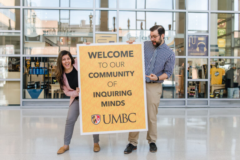
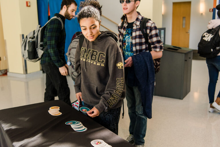
To further introduce the brand and logo to the UMBC community, an on-campus branch launch event was held on April 11. Students were invited to stop by Main Street and grab new graphic stickers, pose for a selfie, enjoy snacks, and pick up a coupon for new logo merchandise in the Campus Bookstore.
UMBC faculty and staff also had a chance to watch the new video and share their thoughts about what being part of UMBC means to them during the Presidential Faculty and Staff Awards ceremony, which took place on brand launch day.
The core ideas behind this project resonated with Morgan Thomas ‘13, general counsel. During the PFASA event, she shared, “When you’re at UMBC, you can explore at every angle” and always find new opportunities “because this is a rich campus full of culture and full of wonderful people where you can learn something new.”
Karl Steiner, vice president of research, agrees, saying, “The themes, including ‘Explore every Angle’ and ‘Extend Beyond’ highlight and value the experiences and ideas of our faculty, students, and staff to pursue new knowledge and thrive to make a positive and lasting impact on our global society through education, research and service.”
“I am excited about how UMBC’s updated brand captures the continuing growth of our institution,” he shares, “as we enter into our second half-century as a campus.”
Banner image: Laptop stickers celebrate launch of new UMBC brand. All photos by Marlayna Demond ’11 for UMBC.
Tags: admin

