Welcome to our new home. Page, that is.
If youre new to UMBC, we hope our new homepage will show you what our university is all about. If, on the other hand, www.umbc.edu is one of your old favorites the new homepage preserves the features our research showed you loved, like easy access to myUMBC and the directory.
The new homepage also adds enhanced features to better help you find campus resources, stay informed about news and events and, generally, make the most of your time at UMBC.
You can take a brief, guided tour of the new homepage below. Here are a few of the principles youll see at work:
1. Homepages are no longer gatekeepers, but storytellers. People increasingly navigate the web by search. So, while its still important that information be clearly laid out, something thats more than a click or two away isnt necessarily hidden. And a homepage, rather than just serving as a map to information, should tell the story of a place. We hope ours does.
2. You matter. The new homepage provides content tailored for certain audiences, recognizing that not everybody is looking for the same thing. Personalized is the way of the web. So, weve introduced content tabs that let you see whats most relevant to you, whether youre a prospective student, current student, parent or family member, faculty or staff member, alum or supporter, business or employer.
3. We needed a friendlier site. Mobile-friendly that is. The new homepage is designed to play nice with just about any device from a desktop or laptop to a tablet or smart phone. This recognizes what we have heard repeatedly from experts on and off campus: mobile is the new normal.
We hope youll love the new homepage, but you might still be wondering, Why now?
First, you should know that the new homepage is one step in a broad, multi-year process to overhaul UMBCs web presence, thinking critically and strategically about how and what we do. Faculty, staff, students and alumni have been involved in a number of discussions about how to improve our web experience, and those conversations will continue.
However, members of the UMBC community and, especially, campus experts advised us of a number of improvements important to make now. Our marketing and recruitment efforts demand a cutting edge homepage, and the innovation and expertise of our faculty in the computer science, information technology and visual design fields further raise the bar. In the constantly evolving environment of the web, we simply cant stand still.
Of course, this is a work in progress. So, if theres something different youd like to see, let us know at homepage@umbc.edu. Likewise, if you love something, let us know too. We hope that the guided tour below will answer most of the questions you have about how to navigate the new homepage, but well keep an eye out for frequently asked questions and provide updates as needed. And we will be paying attention to your broader feedback, although we may not be able to respond personally to every note.
Again, this is just the first step in what will be a multi-year process, and your feedback is not only valued, but crucial.
View As One PageView As Slideshow

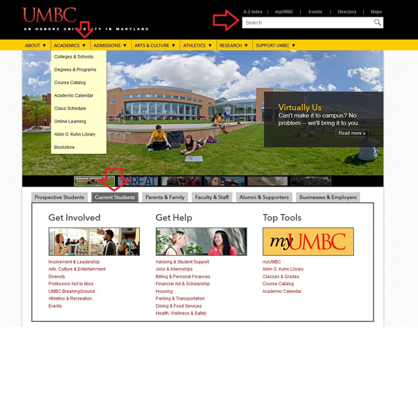
There are three primary ways to navigate from the new homepage into the rest of the UMBC website (see red arrows):
The search function and directory bar
The top level navigation, with dropdown menus
The new audience-specific sections, with content for prospective students, current students, parents & family, faculty & staff, alumni & supporters, and businesses & employers

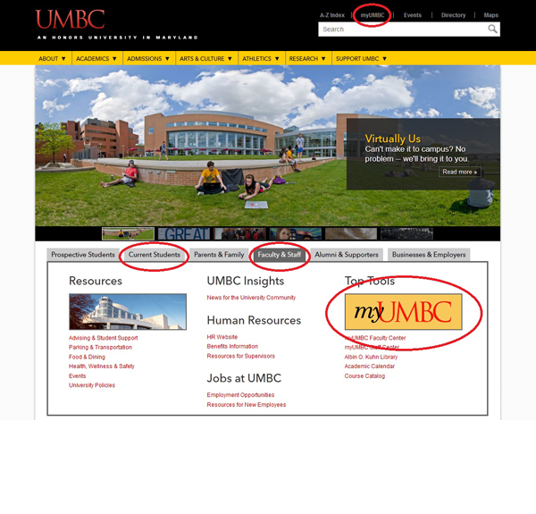
Looking for myUMBC? Youll find it in a number of places (see red circles):
Above the search function, in the directory bar
In the Current Student and Faculty & Staff audience sections, under Top Tools

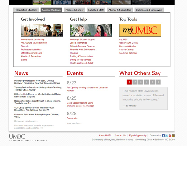
Looking for news & events? Youll find them just below the new audience section.

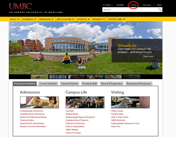
Events can also be found above the search bar, in the directory bar (see red circle).
(8/20/12)

